Have you ever visited a website that looked impressive at first but somehow felt difficult to use?
Maybe there were too many animations, too many colors competing for attention, or so many sections that finding the information you needed became a chore.
It’s easy to assume that a better website needs more features, more visual effects, or a more elaborate layout. But in practice, some of the most effective websites are surprisingly simple.
Good web design isn’t about adding everything you can think of. It’s about knowing what belongs on the page, what can be removed, and how to make the whole experience feel natural.
Start With the Purpose, Not the Layout
Before choosing colors or looking for inspiration, take a moment to think about what the website needs to accomplish.
Is it meant to introduce a business? Generate leads? Showcase creative work? Help customers understand a service?
The answer should influence almost every design decision you make.
For example, a creative agency might benefit from large visuals and a strong portfolio section. A local service business may need clear information about its services, service area, and contact details. An online course website might need to make its courses and registration process easy to find.
These websites don’t need to follow the same structure because they aren’t trying to achieve the same thing.
Once the purpose is clear, it becomes much easier to decide which sections are necessary and which ones are simply taking up space.
A Clean Layout Gives Your Content Room to Breathe
One of the easiest ways to improve a website is to pay attention to spacing.
When headings, paragraphs, images, and buttons are crowded together, even good content can become difficult to read. On the other hand, thoughtful spacing helps visitors understand how different parts of a page relate to each other.
Typography matters just as much. You don’t need five different fonts to create visual interest. In many cases, one or two complementary typefaces, a clear heading hierarchy, and consistent text sizes are enough.
The same goes for colors. A simple palette with a clear primary color and a few supporting shades often works better than a collection of unrelated colors.
These details might seem small, but they help create a website that feels intentional rather than thrown together.
Make It Easy for People to Find What They Need
A website can look beautiful and still fail if visitors don’t know where to go next.
Think about the last time you visited a website looking for a specific service or piece of information. You probably didn’t want to solve a puzzle. You wanted to find what you needed without clicking through five different pages.
That’s why navigation deserves more attention than it sometimes gets.
Keep menu labels clear. Group related information together. Make important actions easy to recognize, whether that’s contacting the business, viewing a portfolio, or exploring a product.
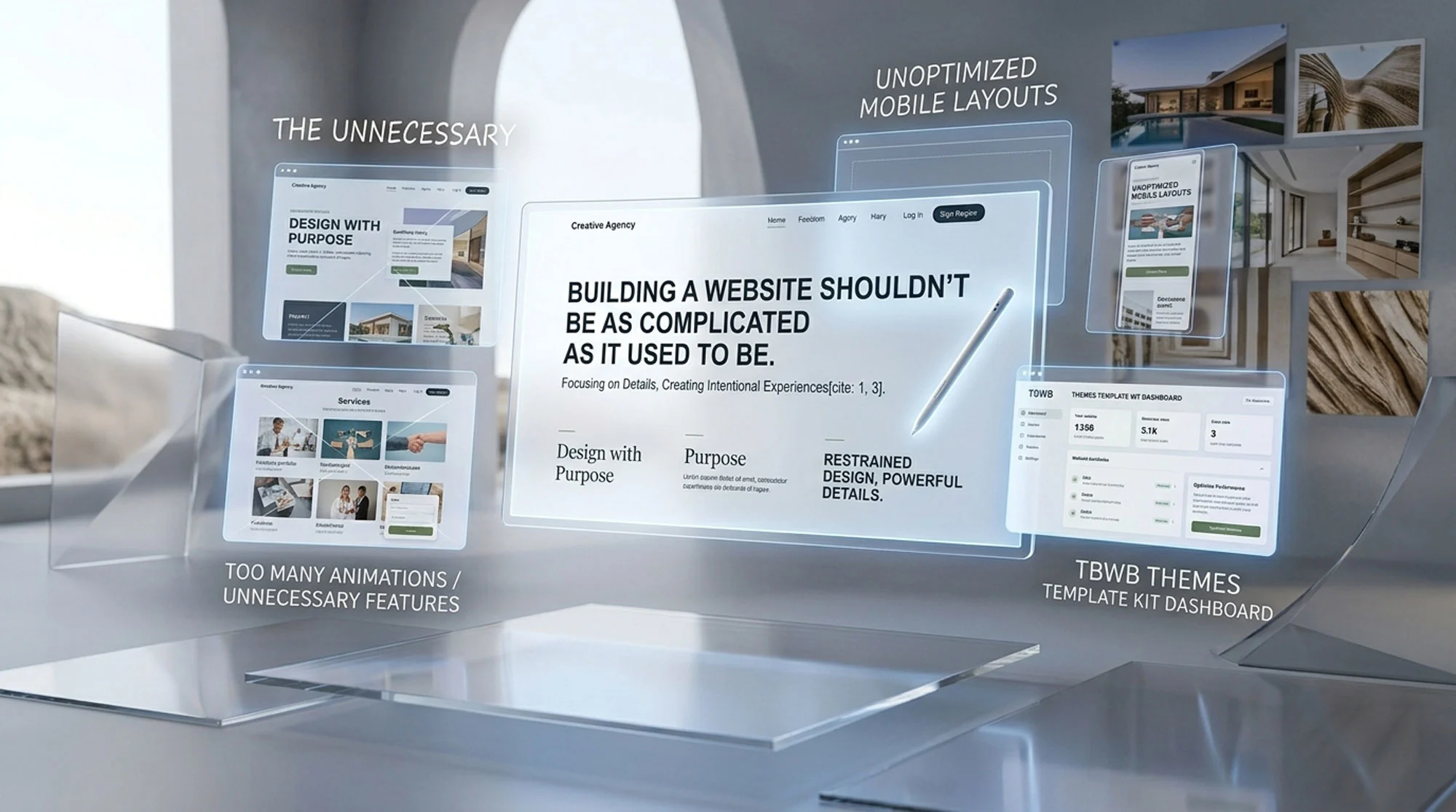
It’s also worth checking the website on a mobile device. A layout that feels spacious on a large monitor can become cramped on a smaller screen, and buttons that are easy to click with a mouse may be less comfortable to tap with a finger.
Good design considers these situations from the beginning, not as an afterthought.
Use Design Tools to Make Better Decisions, Not Just Faster Ones
Modern website builders have made it much easier to experiment with layouts and visual ideas.
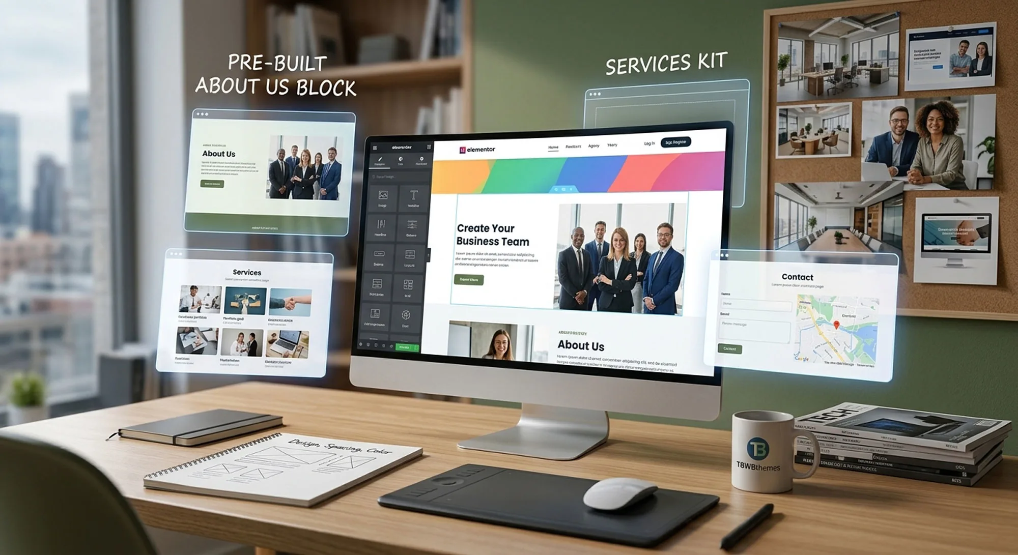
With a tool like Elementor, you can adjust sections, change typography, reorganize content, and preview different approaches without rebuilding an entire page every time you want to try something new.
Starting with a well-designed template can make the process even more practical.
Rather than spending hours creating a basic page structure, you can use an existing design as a reference and focus on what needs to change. You might simplify a section, adjust the spacing, replace the imagery, or reorganize the content to better suit the audience.
This is one reason we create Elementor Template Kits at TBWBthemes. Our collection provides starting points for different website styles and industries, giving designers and website owners a foundation they can adapt to their own projects.
A template doesn’t have to determine every design decision. Used thoughtfully, it can help you get past the repetitive parts and spend more time making the website feel right.
Don’t Forget About Performance
There’s another side to good website design that visitors may not consciously notice: performance.
Large images, unnecessary animations, and poorly optimized elements can make a website feel slow. Even a carefully designed page can become frustrating when it takes too long to load.
Start with the basics. Use appropriately sized images, avoid adding effects just because they’re available, and test your pages on different devices.
You don’t need to remove every visual effect or make every page minimal. The goal is to make sure that each element serves a purpose without getting in the way of the experience.
A little restraint often goes a long way.
Let the Design Support the Message
Trends come and go. One year, oversized typography and dramatic animations might be everywhere. The next, designers may gravitate toward simpler layouts and more natural visuals.
It’s fine to take inspiration from current trends, but not every trend belongs on every website.
A design should reflect the brand, support the content, and make sense for the people using it. Sometimes that means experimenting with a bold visual direction. Other times, it means keeping things simple and letting the message do the work.
The best approach is to treat design trends as inspiration rather than rules.
Final Thoughts
A well-designed website doesn’t need to impress visitors with every possible feature. It needs to help them understand the message, find the information they want, and take the next step without unnecessary friction.
Start with a clear purpose. Give your content room to breathe. Make navigation intuitive, pay attention to mobile layouts, and resist the urge to add elements that don’t contribute to the experience.
Whether you build from scratch or use a ready-made Elementor Template Kit, the same principle applies: every design decision should have a reason behind it.
When the details work together, a website doesn’t need to shout to make a lasting impression.